You’re all set. We’ll keep you in the loop with insights, practical brand strategies, and updates from the Nomad team — built to help you grow a brand that stands out and performs.
Oops! Something went wrong while submitting the form.
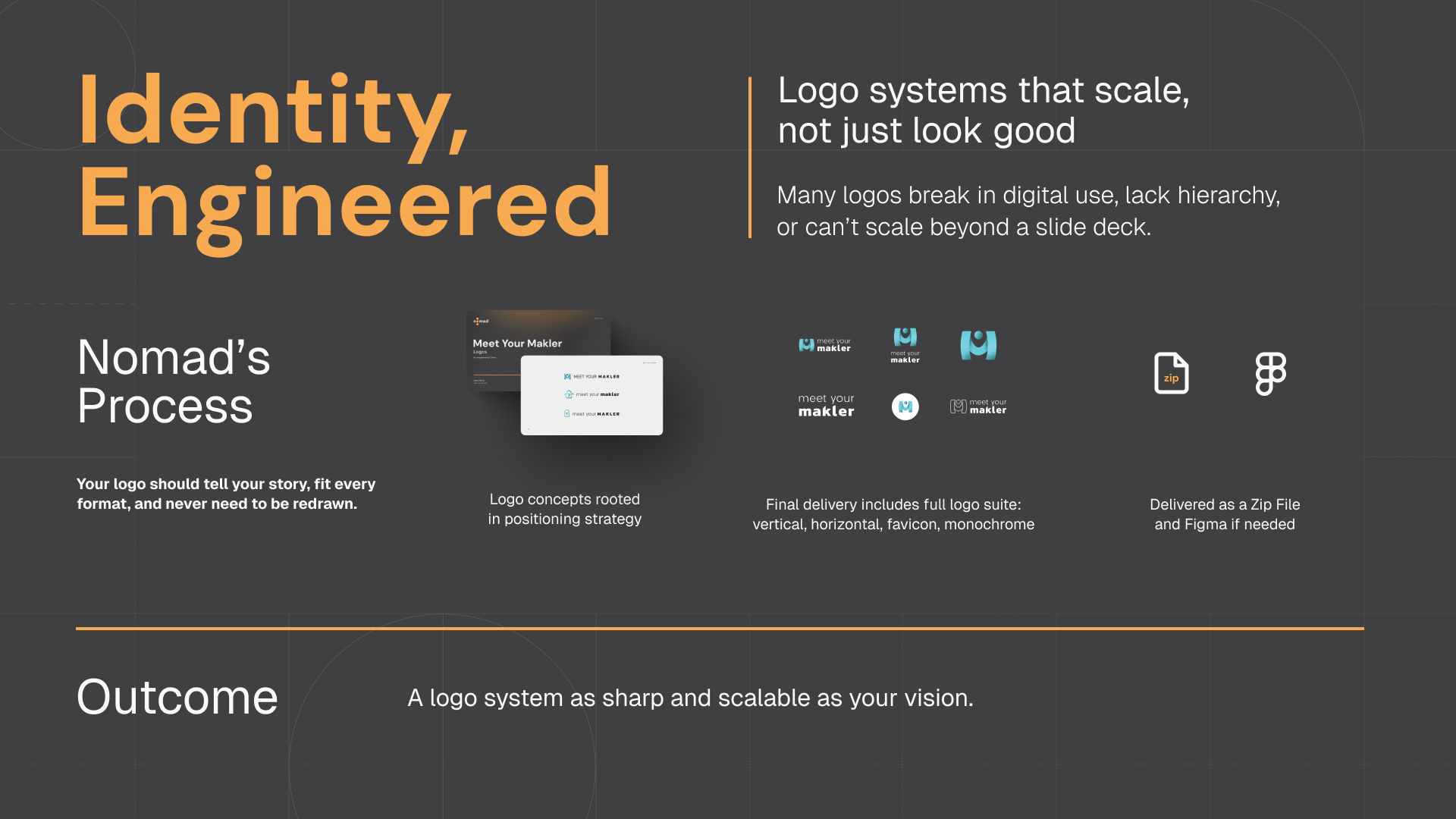
Identity, Engineered – Logo Systems That Scale, Not Just Look Good
Identity, Engineered – Logo Systems That Scale, Not Just Look Good
Logos are supposed to be timeless, simple, and iconic. Yet too many logos today break under the real-world stress test.
A mark might look great when unveiled in a pitch deck or mocked up on Behance—but what happens when it shrinks down to a favicon? Or when it’s stretched across packaging, embroidered on uniforms, or animated for social reels?
The reality: most logos aren’t designed as systems. They’re designed as single images. Without scalable variants, hierarchy, or usage rules, even the strongest idea quickly fractures. The result? Inconsistent brand application, visual drift, and lost recognition.
Worse, a trendy “cool” logo can look dated within a year, forcing a costly rebrand. A logo should be the hero of your brand story—not a liability that erodes trust.
That’s why at Nomad, we don’t just design logos. We engineer identity systems built to adapt, scale, and stay sharp in every medium.
Why Logos Fail in Practice
Here’s why so many logos collapse under real-world conditions:
No hierarchy. Only one version exists, so teams stretch, crop, or redraw it for different contexts.
Too complex. Intricate logos lose detail at small sizes (favicons, app icons).
Too trendy. What feels cutting-edge today can look outdated tomorrow.
No rules. Without clear guidelines, internal teams and external partners improvise—and consistency vanishes.
As Rob Janoff, designer of the original Apple logo, reminds us:
“A great logo must be simple and distinctive—or it won’t be remembered.”
And as legendary industrial designer Raymond Loewy observed:
“More than function itself, simplicity is the deciding factor in the aesthetic equation.”
When logos ignore these principles, they become fragile instead of foundational.
The Nomad Process: Identity, Engineered
At Nomad, we treat logos as systems, not standalone marks. Here’s our approach:
Concept Development – We create three logo directions, each rooted in your brand’s positioning and narrative. Not “what looks cool,” but what reinforces your story.
System Building – Once a direction is chosen, we build a complete suite:
Primary and secondary marks
Wordmark
Icon (favicon/app)
Monochrome and stacked variants
Animated / motion-ready versions
Scalability Testing – Every mark is tested at multiple sizes, formats, and surfaces: from 2D print to animated 3D renders, from billboards to smartphone screens.
Usage Guidelines – We deliver all assets in Figma with margin rules, color usage, and dos & don’ts—so your team never misapplies or distorts the mark.
Think of it like an engine: every part—every logo variation—is engineered to work together smoothly, not just exist on its own.
Nomad’s Six Criteria for a Successful Logo
Over the years, we’ve refined a set of principles that guide every logo system we create. A successful logo must be:
Appropriate – It aligns with the nature of your business and evokes the right feelings. A law firm logo should not feel like a toy brand. The best logos tell the right story instantly.
Consistent – It looks the same across all platforms, preserving integrity. From favicon to billboard, your logo should always feel familiar. Consistency is how trust compounds—customers recognize you faster, everywhere.
Memorable – It leaves a lasting impression. As Rob Janoff notes, if a logo isn’t simple and distinctive, it won’t be remembered.
Legible – It must be readable and identifiable even when tiny or seen from a distance. Logos that collapse in a 16px app icon undermine credibility in today’s digital-first world.
Flexible – It adapts to every medium—websites, packaging, merchandise, social ads—without losing essence. As Design Week emphasizes, versatility is key to scalability.
Enduring – It stands the test of time. Fads fade; great logos endure. Raymond Loewy’s principle of simplicity is what keeps design timeless.
These six criteria ensure your logo is not just a pretty graphic, but a strategic business asset.
Why It Matters: Trust, Versatility, and Longevity
When a logo system meets these criteria, it does more than look good. It anchors your brand identity:
Trust – Customers see the same logo consistently and subconsciously associate it with reliability.
Recognition – A memorable, distinctive mark cements you in the customer’s mind.
Scalability – Flexible systems adapt seamlessly across new mediums and markets.
Future-Proofing – Clean, uncluttered design keeps the identity timeless and relevant, even as trends shift.
As Sagi Haviv puts it:
“A logo is not a sentence, it’s the period at the end.”
That period should be strong, sharp, and consistent—no matter where it appears.
The Outcome is A Logo That Works as Hard as You Do
The end result is not “just a logo.” It’s a future-proof brand asset engineered to grow with you.
Customers instantly recognize your brand—from app icons to business cards.
Internal teams have clarity, with guidelines preventing misuse.
External partners have the tools to reproduce your identity consistently.
Every medium—from modern 2D ads to stylized 3D social graphics—feels cohesive.
Instead of a logo that looks good in one mockup, you gain a logo system that amplifies your identity strategy everywhere.
It’s sharper. It’s scalable. And it’s built to last.
Logos are not decoration—they are design infrastructure.
When engineered as systems, they unify your story across every touchpoint, earn trust through consistency, and scale with your growth.
Because your logo shouldn’t just look good today. It should work for you tomorrow, and 10 years from now.